Recipe Stash Homepage Visuals
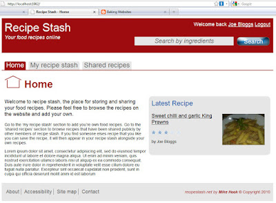
I ve finished updating the mock-up for the recipe stash home page and converted it into a web page. There is a screen grab of the page below, unfortunately you can t poke around the HTML and CSS but believe me it is all there! In this post I m going to outline the decisions I ve taken for the visual design of the page. The next post will go into the considerations I ve taken to ensure the site will be standards compliant and work across all the major browsers. If that sounds a bit dry don t worry I ll be adding in some cheesy headings for your entertainment.
|
| From Baking Websites |
Top to tail
The most immediate visual change you will probably notice, compared to the original mock-ups, is the header and footer background colour. This was a handy hint from the senior designer at Cubeworks, so thanks Jesse! I much prefer how this breaks up the page and gives a clear separation between the main content and the rest of the page.
Press my buttons
I put a bit of time into making a big shiny Search button to use in the header. I found it surprisingly tricky to choose a button that draws attention to the user but doesn t stick out horribly from the rest of the design. I m not entirely happy with the selection but I think its good enough for now. Another button image can easily be dropped in latter if I feel the need.
Tabs for Navs
Another major change in the design (and another top tip from Jesse) is a move away from the vertical icon based navigation menu in favour of a horizontal tabbed menu. This is a more conventional means of user navigation and will probably be easier for them to understand. I m happy with how the visuals have turned out on the tabbed menu, keeping colours in line with the rest of the site and curved corners for a more current feel.
Heading Home
I ve retained the icons that were originally used on the navigation. They are now displayed to the left hand side of the main h1 page heading. These icons are one of the few graphical elements on the site so I m pleased that there is still a place for them here. I think they provide an immediate prompt to the user as to which section they are in, complimenting the nav menu highlighting and h1 heading text itself.
Colour me red
Although not really shown in the image above, the plan is to still use a different colour for each of the main sections, which will be most evident in the main navigation and heading colours. This point will be one to revisit once I ve completed the other section pages.
<
p>That just about wraps up the main visual changes for the home page. In the next post I ll be taking a look behind the scenes at the technical decisions I ve made to generate the page.